


Making a promotional video for dyslexie typeface to introduce it to more people.
October 7th - December 7th 2020
AE, AI
Nicole Carino (voice acting)
I pushed my limits of drawing characters and backgrounds in AI. I also learned a lot about working between AI and AE.
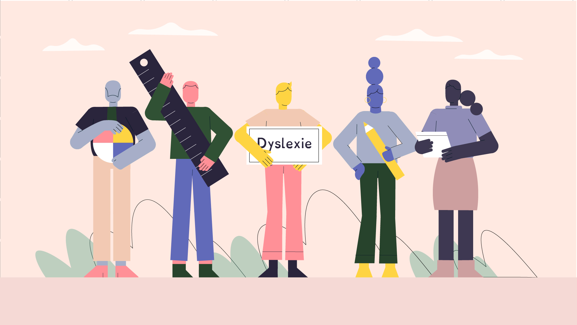
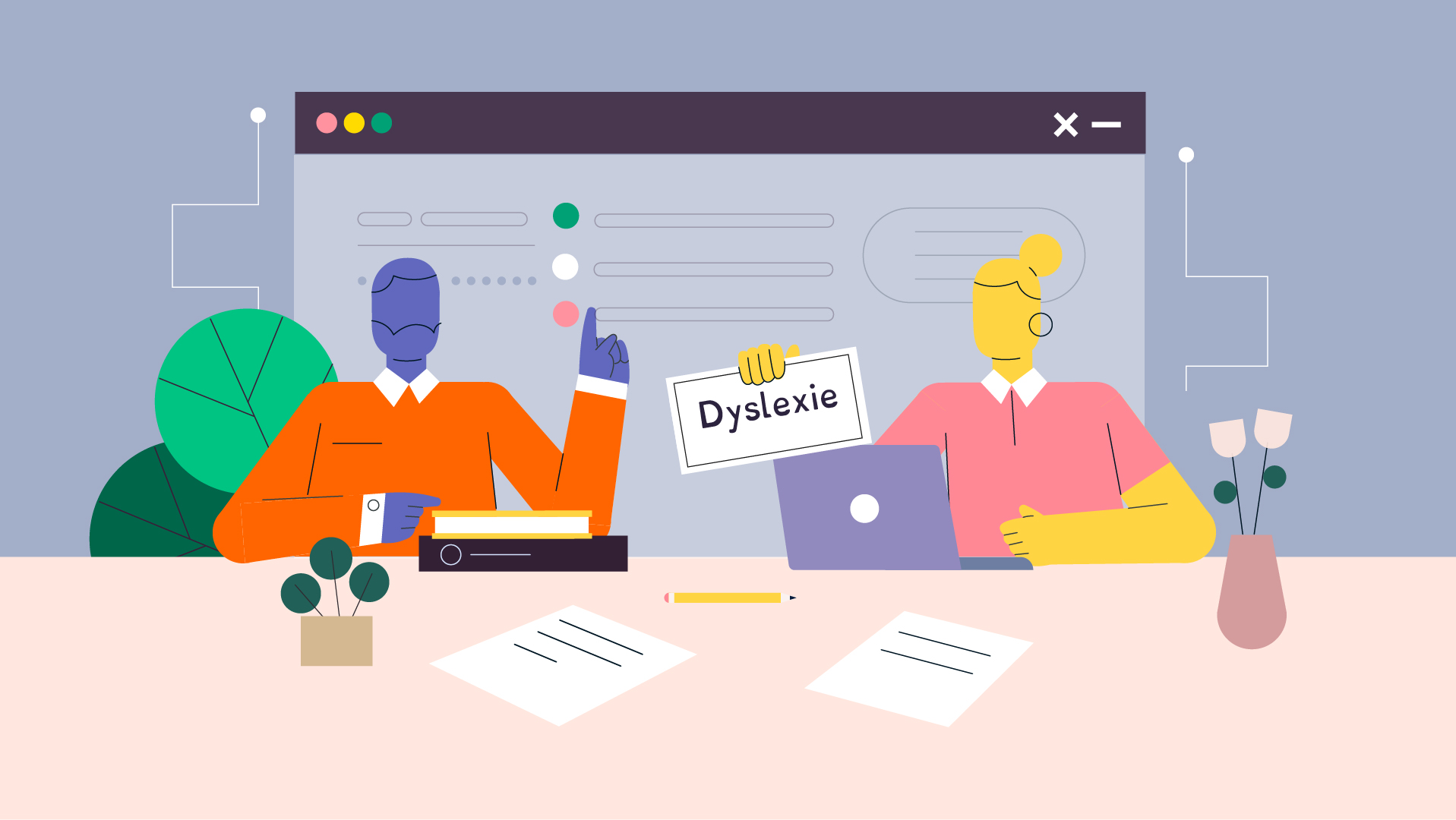
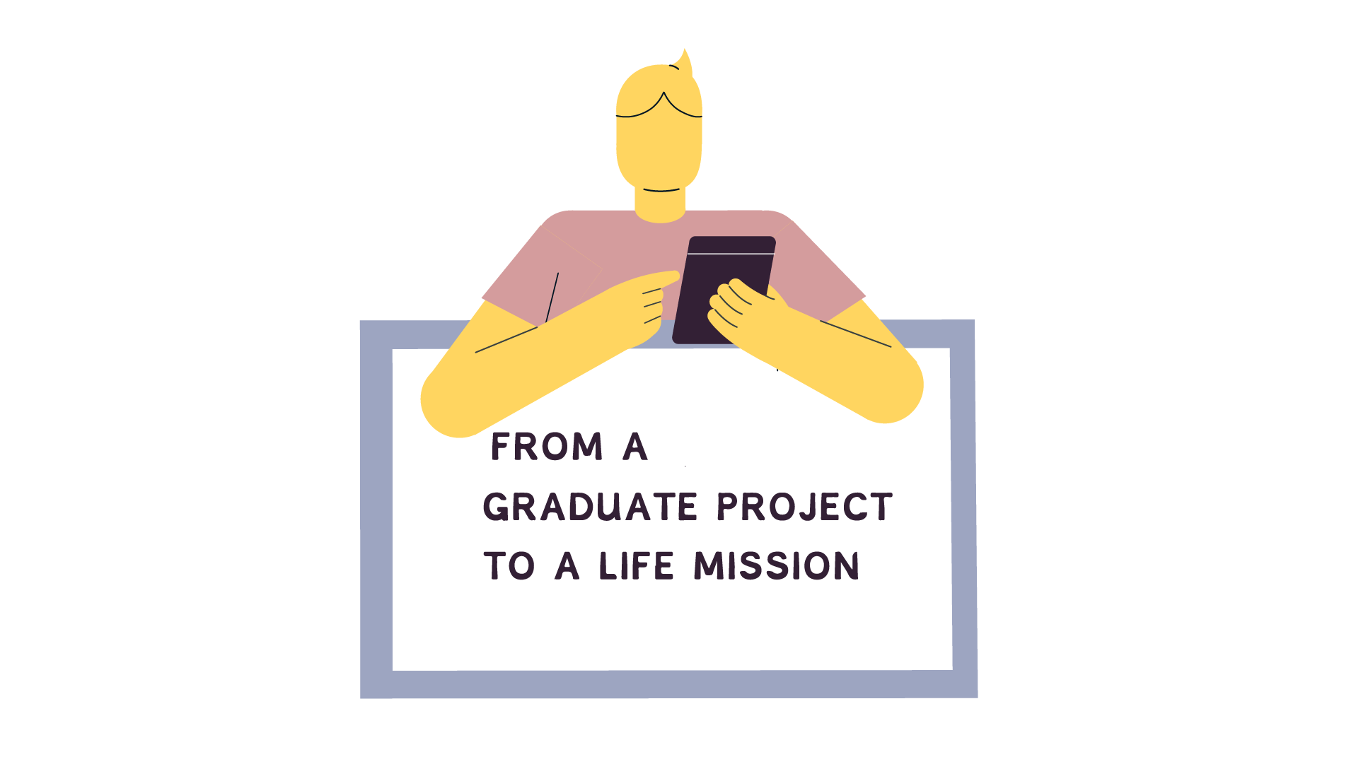
As long as he can remember Christian Boer has been challenged by dyslexia. From his graduation project in Graphic Design at the University of Arts Utrecht, it became his mission to focus and improve how he and people with dyslexia could read.
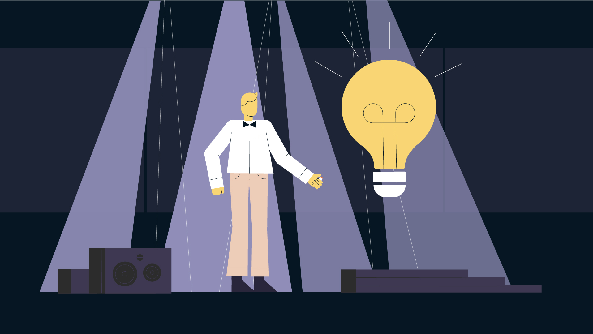
Christian's story is very motivational, and I appreciate that the font makes reading accessible for everyone. I hope the audience understands why the font is so helpful for people with dyslexia. With this in mind, I started gathering inspiration for possible visual directions.

After writing the font's story into a concise script, I began to sketch out how I wanted to visualize each scene.
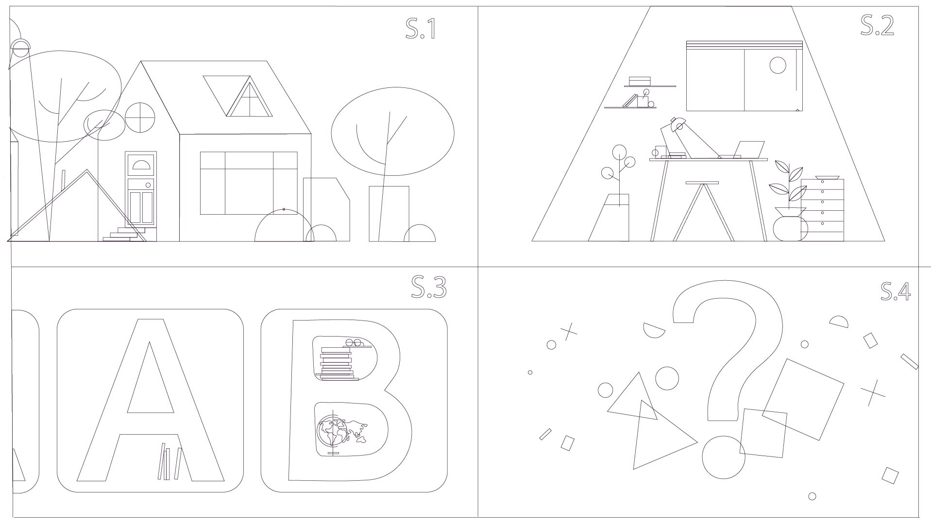
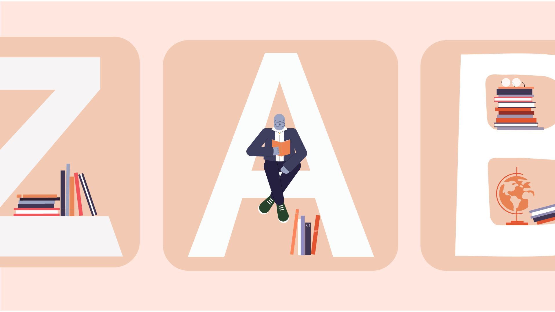
The video's visual is supposed to explain why the font is readable to people with dyslexia and build an emotional connection with the viewers. The color choice, illustration style, and music helped establish the font's friendly appeal.
Friendly, playful, passionate
Vector characters looks modern and clean. Still, they have all the critical features of a human to convey clear messages to the audiences. I chose not to draw any facial features so the audience can focus on the characters' actions.
The animation's narrative felt heavily on the voice acting, so I worked with a professional voice actress to ensure the quality of the audio. Besides, I put in a calm and upbeat soundtrack to emphasize the friendly image of the font.


Copyright © 2020 Cindy. All rights reserved